

Pattern play….
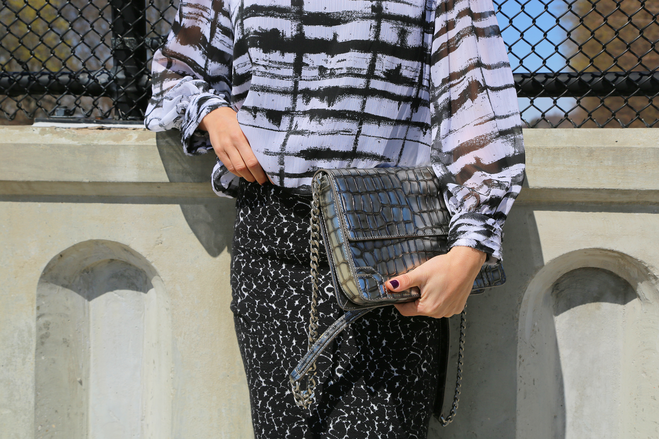
A Style Tip for mixing prints…..don’t match the print, match the colors! If the colors look good together, more often than not the prints will look good together too. It is also helpful to mix prints of different scales….choose one print to dominate and the other to accent. Today, I did both….I wore a simple color … Pattern play….
A Style Tip for mixing prints…..don’t match the print, match the colors! If the colors look good together, more often than not the prints will look good together too.
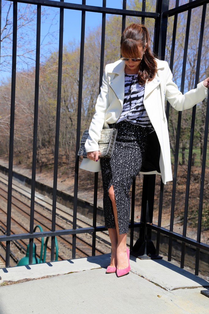
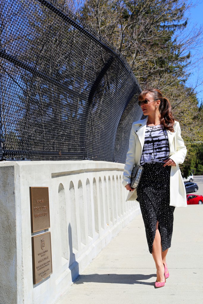
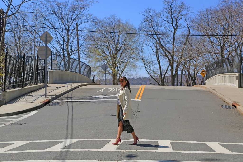
It is also helpful to mix prints of different scales….choose one print to dominate and the other to accent. Today, I did both….I wore a simple color palette of black and white and mixed 2 prints of different scales, one stronger than the other. The bigger print with a white background compliments the smaller darker print, which from a distance reads as a solid. The blousy top also accentuates the clean lines of the skirt. When in doubt layer a neutral solid color to break up the prints, i.e. a jacket, belt, or handbag. For an easy vibe choose a solid color shoe, like these dusty rose suede pumps. I added just a touch of matte shine with this crossbody which takes the place of jewelry. Don’t let prints scare you…mix it up!


What I wore:

Join the conversation